Choosing our Exterior Paint Color

Choosing paint colors can be tricky. It's one of the most frequent topics I am asked about. Choosing exterior paint colors can be even trickier as colors will often look very different on the front, back and sides of your home depending on which direction your house faces and where sun and shade are. Finding a paint color that looks good on all sides, in all lighting, during the day and at night can be overwhelming. 

My biggest advice is to test, test, test. Never go by the that little paper swatch and even if you've used the color before in a different space it doesn't mean it will work somewhere else. I always recommend painting a decent size swatch (12' x 12" at least) on all 4 walls of an interior room or on front, back and side of your exterior. 

Watch the swatches for a few days and check how the color looks at different times of day. Light makes such a difference in how paint colors appear and you want to find a color that you love during the day and at night equally. 

On to our house...

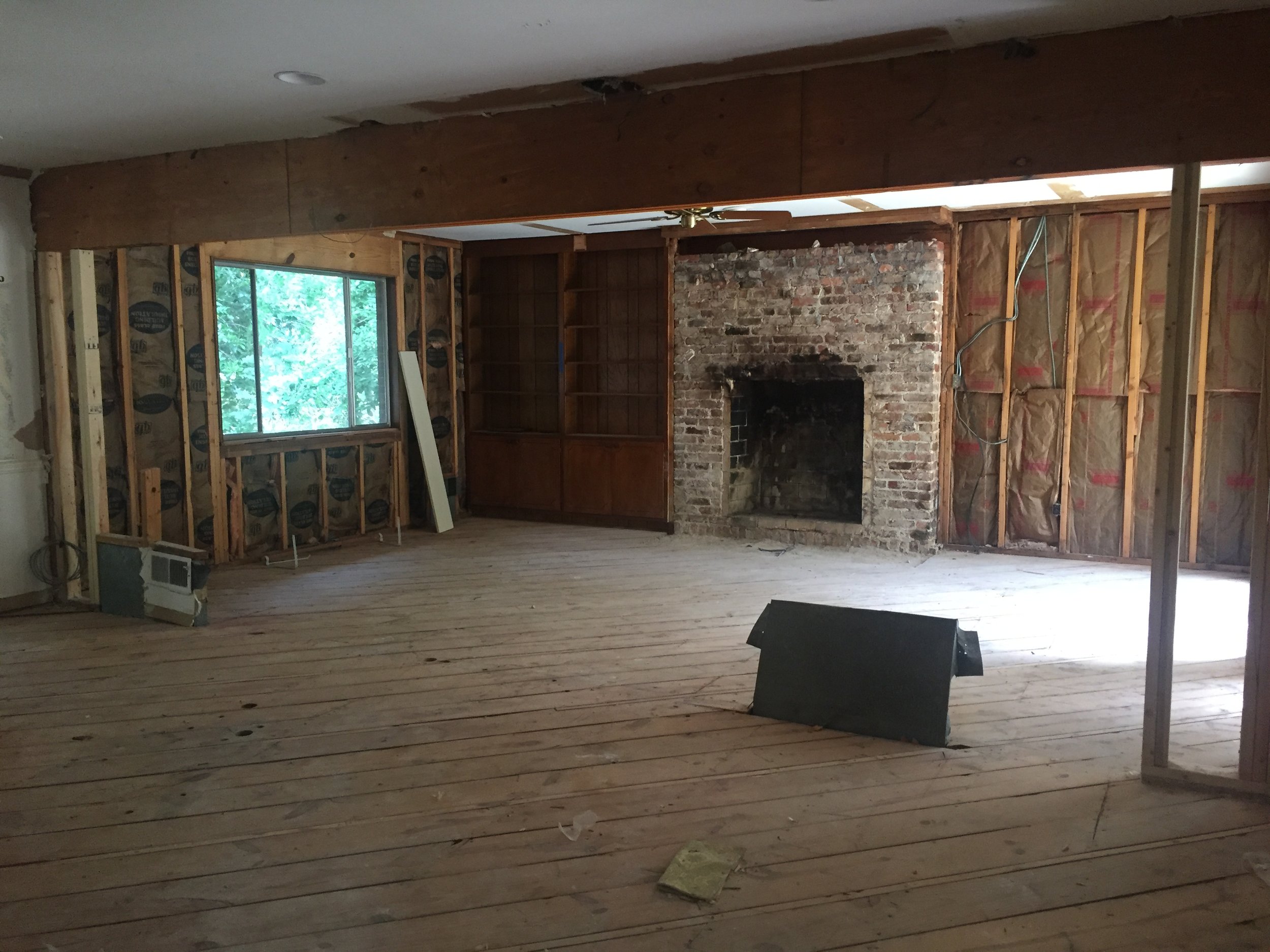
Our home was built in 1968 and is a mix of brick and wood. I know painting brick is a controversial subject, but I LOVE painted brick. Especially if your brick is like mine - a gross yellow-y brown with pink mortar. WHY WOULD ANYONE USE PINK MORTAR?! It is beyond me, but my house is proof that it happened. 

Exterior1.jpg

When I see this picture from the original real estate listing, I have a hard time remembering why in the world we even went to see it. It's a little bit (OK, A LOT) of an ugly duckling I know, but it seriously has some great bones. We saw so much potential and we knew we could make it amazing. So I know you might be cringing right now, but just wait till we finish this exterior makeover. 

Below are the current paint swatches we are deciding between.

IMG_8990.jpg

1 / Custom color I mixed and used on our last home's exterior

2 / Benjamin Moore Black Iron

3 / A mix of 1 and 2

4 / A slightly darker mix of 1 and 2 

It's really hard to tell between 3 and 4 in this picture, but in person you can definitely see that 4 is darker. I really like 3 and 4 and I think one of those is our winner. I'm going to let it marinate for a few more days before I fully decide.

If you follow me on Instagram, I posted the easy process of mixing your own color to get the perfect shade in my stories. I may try to figure out how to put the stories all together in one video and post it here (we'll see....I'm not the most tech savvy).  

Which one is your favorite? 1, 2, 3 or 4? I'd love to hear your thoughts! 


|Before & After| English Village Project: Kitchen

I'm sad this project is over because these clients were really fun to work with! They were laid back and easy to please and really trusted my vision for their space. This project started out as a tiny powder bath & a small kitchen facelift. It turned in to more of a major kitchen facelift and half way through, the clients decided to add in their master bath and their outdoor patio space as well. I'm so pleased with how each space turned out! I'll stick to the kitchen here and share the other spaces in a separate post. 

First.....the before:

before2.JPG
before3.JPG
before5.JPG

This kitchen design was only five years old, but the clients really wanted something different. The mirrored backsplash and the stainless steel shelving and accent wall made the space feel cold. The space doesn't get much natural light so one million recessed lights had been added to offset this, but it was too many and added a harsh, unflattering light. The clients wanted to make the kitchen feel more warm and inviting and I definitely think we accomplished that!!

The afters:

IMG_9904 2.jpg
IMG_9899.jpg
IMG_9905.jpg
IMG_9915.jpg
IMG_9926.jpg
IMG_9937.jpg

My plan for the space was to brighten it up, but also bring in warmth and depth. We removed many of the recessed lights and instead brought in pendants over the island and sconces over the sink that brought a soft, more flattering light. We added depth by painting the lower cabinets a beautiful, deep navy/charcoal color. For warmth, we selected handmade tile in a warm white in place of the mirrored backsplash and stainless steel insert above the cooktop. We repeated that same tile on the opposite wall from counter to ceiling to add visual interest. We replaced all the stainless steel shelving with floating wood shelves and we switched out the satin nickel hardware with warm brass. Leather barstools for the island and a vintage turkish runner with hints of coral and navy were the perfect accessories to finish out the space.  

There were no layout changes, major construction or demo, but the transformation is pretty dramatic!

Stay tuned for the bathrooms and outdoor spaces next!

|Before & After| My Kitchen!

I finally got the professional photos back of my house and I am so excited to share with you guys! There are a lot of pictures so I'm going to divide the spaces up into separate posts. We'll start with the kitchen. 

My husband and I knew this was our house the minute we pulled up, before we even set foot inside. We just had that feeling. When we walked in it was full of yellow walls, a mint green bathroom, a lot of wood paneling, light switch plates with brass eagles (not making that up) and an astroturf garage! But I saw the potential and I knew we could make it amazing. 

So first, the before kitchen pictures. 

oldkitchen4.JPG
oldkitchen1.JPG
oldkitchen2.JPG
oldkitchen3.JPG
wall between den and kitchen.JPG

And the after:

Deneke_091817_10.jpg
Deneke_091817_11.jpg
Deneke_091817_08.jpg
Deneke_091817_04.jpg
Deneke_091817_09.jpg
Deneke_091817_05.jpg

I'm still shocked when I look back at the before pictures. I can't believe the change!

We started by removing that paneled wall between the den and kitchen to open up the space. Taking that wall down brought in so much natural light and made both spaces feel larger. Next, we demoed everything including 6 layers of flooring in the kitchen (no lie) and all the cabinets and appliances. I'm so glad I went with my gut on the black cabinets even though almost everyone told me I was crazy. I LOVE them. And that backsplash - those 2x8 subway tiles are so good! They are still classic, but just different enough from the standard size. And having them Installed in a vertical pattern adds that modern twist that makes me so happy. I had a local company build my open shelves and I love the way they break up the dark cabinets and give me something to constantly re-arrange and style. 

You can't tell from the pictures, but the tall cabinets on the right side actually lead to a large walk in pantry. We stole some space from the garage to make that happen, which was my contractors genius idea. Even though it's hidden, its one of the best, most functional features of this kitchen and I'm so glad he thought of it. I plan to take some pictures and post about the pantry at some point. 

Check back soon for before & afters of the rest of the house!

Kitchen Sources: General Contractor: Lorino Construction, Cabinets: Brewer Cabinets, Tile: South Cypress, Open Shelving: Barnwood Customs, Hardware: Brandino Brass, Plumbing Fixtures: Fixtures & Finishes, Appliances: Kitchen Aid, Sconces: Cedar & Moss.

After Photos by Ashley Lauren Studios

|Before & After| Crestwood Bath

A small bathroom can be a challenge, but it doesn't have to lack fun design. We did not have a huge budget for this project so we splurged on a few things that would make a big impact and we kept the rest very affordable.  

Previously this bathroom was a 90's wonderland of taupe and bad tile and a really scary tub with jets that spewed mildew. 

catiebathbefore2.JPG
catie bath before1.JPG
catiebathbefore3.JPG
catiebathbefore5.JPG

And here is the after!

catiebath after2.JPG
catiebath after1.JPG
catiebath after3.JPG
catiebath after4.JPG
catiebath after6.JPG

This bathroom only has one tiny window so we lightened it up as much as possible with a bright white paint. The marble hex floor tile was the biggest splurge, but the scale was perfect for this small space and I love the color variation the marble brings. Tiling out the front of the tub and a feature wall behind the sink was another extra that wasn't necessary, but it really finishes out the space nicely. The pedestal sink, toilet, mirror and even faucet were all very affordable. We finished off the space with a great light fixture from Cedar & Moss a fun turkish rug in coral and navy for some color! 

Such a big improvement for such a little space! 


Design Board: Kitchen/Den

We are getting close on our renovation and I am scrambling to make final decisions on furniture and furniture layouts (and a million other little details). I find design boards are really helpful to me for choosing furniture. Seeing everything together in front of me (instead of just in my head) really helps me to see what works together and what doesn't. 

My biggest struggle in this project has been this kitchen/den space. If you've been following along, there was previously a wall dividing these 2 spaces making them both dark and small and I was dead set on removing that wall to open them both up. I was so glad to see it gone, but I didn't anticipate the design challenge in making sure that all the furniture and finishes in this big open space worked together and the space still functioned well.

Just to recap: here's the space before we did any work. 

Here's the space right after they removed that lovely paneled wall.

And then the space once they removed all the old cabinets & flooring

Here's a view from the other direction right after they started installing my cabinets. {side note: I am so so happy with my black cabinets!}

My goal is to have this new open space function as three things: kitchen, eat in kitchen area and den/sitting area. Below is the design board I've been working on for this space.

Design board sources: Bar Stools // Sofa // Rug // Woven Chair // Leather Poufs // Coffee table  // Light fixture // Tulip table: vintage // black Eames style chairs // Artwork

I am so excited to finish our renovation and share the before and after pics! So far I'm really happy with how everything is coming together! Stay tuned.....


My Favorite Modern Light Sources

Lighting is so much fun! It's like the jewelry of a room - you can add drama, a little sophistication or even a hint of glam with the perfect light fixture. I've spent hours lately sourcing lighting for my own home trying to find the perfect lights to add a little modern touch, while not blowing my budget. And since finding great lights at an affordable price can be difficult I thought I'd share some of my favorites!

light sources.jpg

1   2   3   4   5   6   7   8   9   10   11   12   13

I wish I had a place for all of them in my home! So far, I plan to use [1] in my kitchen above the open shelving. [5] In my powder bath. [10] I've already ordered and it's currently sitting in the garage. The picture doesn't do it justice - it's so much larger in person - almost 5 feet across! It's really pretty and I can't wait to see it hanging from my vaulted ceilings in the living room.

For our den, I'm still trying to choose between the other chandeliers above. I recently stumbled across Billy Cotton's Pick Up Stick collection and fell in love hard, but they are so out of my budget it's not even funny. I'm really drawn to [11] and [12] above because they remind me the most of the Billy Cotton. [9] has a totally different vibe going on but I love it so much also and [13] really makes a statement with the large glass globes and its slightly asymmetrical shape. Just give me ALL THE LIGHTS!

Which one is your favorite? 

Powder Bath Moodboard: #clientmemyselfandi

I never could have imagined how many hours I would spend agonizing over the details of a tiny 5'x5' powder bath! I consider myself to be a pretty quick decision maker, but apparently that only holds true when it comes to other peoples homes. Not my own.

So it took me a while, but this moodboard finally came together and I'm pretty happy about it! I can't wait to see this fun, little bathroom come to life!

Kitchen Moodboard: #clientmemyselfandi

If you follow on Instagram, you probably know that I've purchased a new home! And while it's got great bones and some amazing architectural features, it's in need of some updates! The first area to go will be the kitchen! Currently it's a room full of bad 90's oak cabinets and a diamond backsplash. Plus it's small and dark with a poor layout that is not functional. 

Here's the current kitchen: 

The wall on the left separates the kitchen from the den. This wall makes both rooms small and dark. So we are taking it out completely to open up the floor plan and bring in more natural light. I can't wait!

Here's a quick sketch of the new kitchen layout

Below is my moodboard for the new space. I'm bringing in lots of modern elements like open shelving, vertical subway tile and white quartz countertops), but still keeping a few classic elements like the shaker style cabinet doors.

Below are a few dreamy kitchens from my favorite designers that I have been obsessing over lately. 

via Kellen Minor (Kellen.Minor on insta)

via Kellen Minor (Kellen.Minor on insta)

We should start demo in a few weeks. Stayed tuned for more updates!